Selling your products to customers around the world has never been so easy and e-commerce allows customers to buy your products at all hours of the day.
However, with so much competition online, are you paying attention to the little details or applying a one-size-fits-all approach to international e-commerce? We outlined the four missteps that international retailers should avoid below.
1. Thinking the only difference is language
Creating international adaptations go beyond translating your website into different languages.
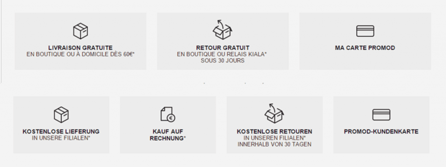
When we conducted an analysis for Promod, we noticed the differences between French and German users when it came to the general terms and conditions. One compelling finding was that German users were more likely to read the Terms and Conditions (Kauf Auf Rechnung) than the French users.

This allowed the retailer to accommodate their German users by making the terms and conditions more accessible by adding it to the reassurance bar.
Tip: Do you customers care more about gifts and samples or promo codes? Are they clicking on text that does not link to anything? Retailers use behavioral analytics, such as heatmaps and clickthrough rates, to see which content piques the user’s interest.
2. All forms are created equal
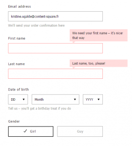
Addresses, phone numbers, even titles and honorifics all vary across different borders.
The order in which users input their information (whether in the identification or the billing section) has a high probability of drop off due to the time and effort it requires from the users.

Retailers can keep a close eye on these crucial steps of the checkout process by tracking erroneous entries and time spent filling out each field.
ASOS lets me know that by opting to give information about myself will result in a personalized experience through recommendations.
Tip: Guide the user and validate their responses. Give examples beneath the form typically in grey or italicized font to help elicit the right response. Users are more likely to fill out the fields as long as they know how it’s being used and how they will benefit from it.
3. Shipping and delivery
When it comes to shipping options, retailers need to hit that Goldilocks sweet spot. Too many options and your customers will be overwhelmed. Too little options, and you fail to anticipate customer needs.
When we conducted an audit of skincare retailer, we noticed that users in Russia were hesitating longer on the shipping page. A long list of shipping options made it confusing to buyers and they were more likely to leave the page.

They resolved this by reducing duplicate options and adding logos to facilitate the selection.
Tip: User hesitation and hovering over a field suggests ambiguity and cause users to leave the page. Make sure when you offer options to users that it is clear and easy to read.
4. Payment preferences
This step of the checkout process is often where customers drop out the most.
From a UX standpoint, maybe this phase of your checkout operates flawlessly--an enclosed checkout free from distractions, auto-fill form fields, and delightful copy to guide them to completing the order.

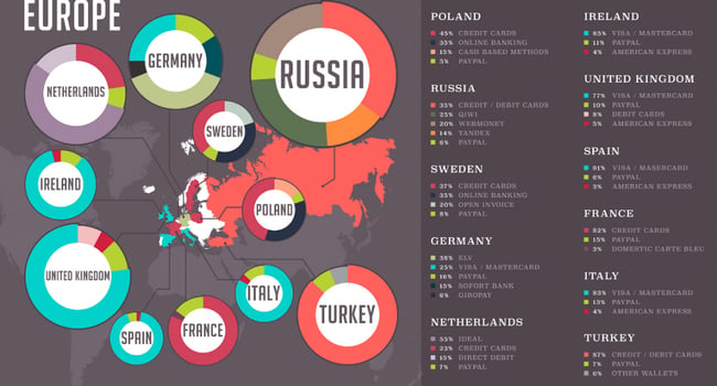
via Expert Market
It is important to know if your customers are comfortable paying with credit cards, bank transfer, cash-on-delivery, or if they need other alternatives.
Recently, Airbnb updated their payment structure in Brazil for the upcoming Rio Olympics to allow national credit cards and increase accessibility for Brazilian hosts.
Tip: Conducting a thorough, behavioural analysis can give you another look into cultural norms. Be open to adapting your policies (à la Uber) to reduce friction during the payment process.
Conclusion
Retailers need more than translations and currency converters to accommodate their international users.
Understanding customer expectations and delivering an effortless customer experience starts with the right data matched with actionable insights.
To read more about international e-commerce, check out our infographic.
Photo by Daria Nepriakhina